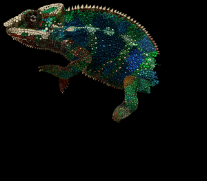
I’m thinking that when I get this chameleon drawing is all finished up, I’ll try to increase the saturation a bit to help keep him bright and colorful. Right now, he’s looking a little washed out in a few places. What do you think? Should he be brighter?

