Space Trek: Day 127

Space whale comic book cover

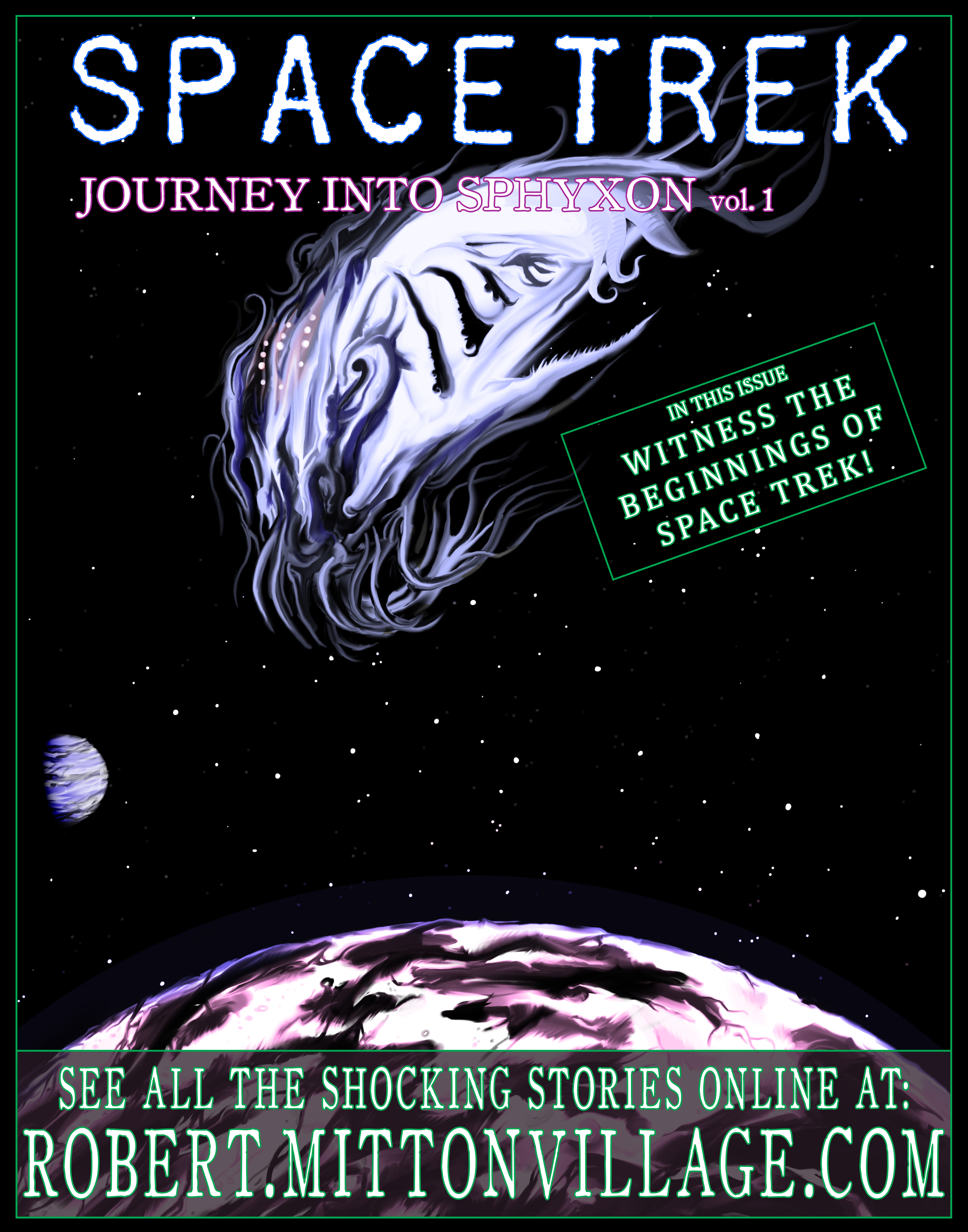
I’m a little bit disappointed right now! Don’t misunderstand, I think the picture I did today is the absolute best thing I’ve ever created. However, it’s so good in fact, that I’m totally disappointed that this isn’t a real comic that I can flip through. I made something that is completely badass, and not even a real thing. It’s a strange and new feeling.

I’m not even quite sure what the plot of this comic-book would be. I mean, Space Trek? You’d assume you would be travelling through space in a “spaceship” of some sort. I think if this was a completely real comic book, then it would traditionally feature either some of the main characters (if not all of them) looking skyward all important-like, or the spaceship they use for the entire series, on the cover of the first issue. Unless, which is the case for this “fake” old-timey comic series, your ship is a organic space whale. I think the first volume of this series would be mostly about a giant space creature revealing itself to us and the panic that would follow here on Earth. A more sinister force would then show up, also from deep space, and the original space creature would actually help defend Earth. Only then would you meet the would-be heroes of the story as they assist. That would probably work.

So, I definitely don’t plan to top this image for tomorrow’s work. I’ll probably take it easy and keep it simple. So, now’s the time when I ask the readers out there; got any suggestions for themes, colors, etc. for tomorrow? Thanks for checking this out. Don’t forget to share on the Facebooks! I really appreciate it. Take care!

Facebooktwittergoogle_plusredditlinkedinmail

Space Whale: Day 126

Alien space creature descending on a unsuspecting planet

Well, this kind of looks like the cover to an epic comic book. And as soon as I figured out that my nebula kind of looked like a creature, I thought it looked like a cosmic whale thing from Star Trek. Don’t you think?

I have to say, this guy turned out really awesome. The planets too, for that matter. All of this was painted with the mixer paint brushes in Photoshop. Usually when I make a space scene (Thanks for the suggestion, Justin Earhart!), I use lots of features (like adding graininess to the image as stars) to create it. However, this time I just painted the whole thing. Sure, it takes a lot longer, but then you have complete control over everything and actually have to put in the work.

Speaking of which, this entire thing, from start to finish, took roughly 3 hours. Not too shabby for how awesome it all turned out. Sometimes, as any followers of my website would notice, it takes me days and days to paint something decent.

So, any suggestions for next time? My sister suggested that I draw something “jungle” related. So maybe I’ll try that. Probably something abstract and not actually trees and such, but who knows! We’ll see what I feel like tomorrow.

Facebooktwittergoogle_plusredditlinkedinmail

Frozen: Day 125

Blue, black, and white Photoshop painting titled, "Frozen Notch"

My god, did this ever take forever. I’m not sure what I was thinking when I started making this. At first the small brush strokes that make up the blue, black, and white image took an hour or so, followed by an hour and a half of tiny little notches to cover the entire painting. The things I do to “potentially” make things look cool. I had no clue how this would turn out and honestly, it wasn’t worth it! My hand is sore, and I don’t think it looks like anything special really. However, as always I learned a whole bunch about particular brush settings and color mixing etc. Overall, it was a very positive experience. Here’s what I started with (picture below)

Original Frozen Photoshop painting

Today, I also looked into how to get my artwork printed out. Snapfish.ca seems like a good bet. They have canvas printing which could be pretty neat! I have to look into it some more but this seems like the place I’ll shop at when I’m ready to sell my work. Assuming anyone will actually buy it. Perhaps today’s work isn’t the best example. However, I plan on painting at least 50 paintings in the next couple months so we’ll see if any of them are worth printing out! Either way, it’ll be a fun experience.

So, for tomorrow then, any suggestions? Colors, themes, etc. Anything would be appreciated! Write some in the comments. Thanks, Brad for the “ice” suggestion yesterday.

Facebooktwittergoogle_plusredditlinkedinmail

Threads and Waves: Day 124

Photoshop Painting titled, "Threads"

I feel like I could just keep on painting these throughout the day. Even though my laptop is a little bit slow when I’m working with such massive image sizes, I can still get these paintings done. It just loads slow when I use large brushes, therefore effecting huge amounts of detail across the image. I’m not sure what kind of computer upgrade I would need, but it would probably have to be substantial anyways. I think I’m good with what I’m working with currently. Not that I can just go out and buy a new computer anyways.

This first painting (above) I titled “Threads”, because that’s exactly what it reminds me of; strings of fabric. If you open up the image full screen you’ll notice how much detail is actually in there! I’m impressed with the performance I’m actually getting out of my computer with all things considered.

Photoshop painting called, Making Waves."

I have another image to post today as well. I did this one right after doing the “Threads” one. It’s directly above and I call it “Making Waves”, for reasons that should be obvious. This version that I uploaded is actually smaller than “Threads” because I’m keeping the full sized image on my hard-drive. So when you open it up it should have less detail than if it was the actual original version. However, like I said, I have the original full-sized file available. I’ll just post a small second image to show the detail. I think the zoomed image could easily be it’s own standalone painting! Any suggestions on colors or themes I should try painting next? Ideas are always welcome.

Zoomed in painting

Facebooktwittergoogle_plusredditlinkedinmail

Supernaturally Sinister: Day 123

Photoshop painting called "Lurking Beneath"

Wait a tick, that’s not the painting from yesterday! Yeah, well I sat down and loaded up the painting I’ve been working on for five days now, and realized that I dreaded working on it. That’s not what this project is supposed to be about. I’m not sure if I’ll go back to it yet, especially after what I created today, but I’m leaving it alone for now. The frustration is gone and now I’m enjoying this “me time” once again with today’s unique piece.

Well, where do I begin with what I painted today? I feel that today’s image comes across as very supernaturally sinister. There’s only one color: Crimson red, and the rest is all black and white. I’m not really meaning to get too detailed, but I originally wanted this to just be black and white to begin with. Two opposing tones to signify two opposing sides. Then I used both vertical and horizontal brush strokes to blend it all together. I added in some red and right away it felt bloody. I imaged this as a poster on my wall, and added some bright white, which usually signifies something supernatural-esque (think Ghostbusters), creeping over the sides of the poster. I then blended the red into everything else using similar techniques as I did with the white and black. I finished this picture off with the claw marks as a spot to draw the focus away from the ominous dark shape.

I think it’s pretty neat. This was so much fun that I’ll probably do some more as the days go on. I have a feeling I’ll want to do some real painting, similar to what I worked on today, sooner than later.

Facebooktwittergoogle_plusredditlinkedinmail

Struggling: Day 122

Photoshop mountain painting

This was so frustrating to work on today. No matter what I did, I just could not get that dock to look right. So it’s black! After that I just wasn’t in the mood to do anything else, but I tried to do a bit of the detail on the mountain in the background, and I guess it’s turning out alright. Surprisingly.

Other than that I just lightened up the gold color so it’s not as bright. Please let me know if that looks alright for everyone. You never know if one screens colors are the same as another.

Facebooktwittergoogle_plusredditlinkedinmail

Glory Docks: Day 121

Painting created in Photoshop

I hope that’s not too much gold. Looking at this version now it might be a little too bright. It definitely needed a shot of color though, no question. It’s easy enough to fix if it is indeed a little too bright. This image should be a decent size, so full screen it to get a proper look at it. Let me know in the comments if the color is too much, please!

Today I added more branches and detail to the trees (Boy are those dying trees taking forever to finish!) and I’m closer to the lake looking more realistic. It’s not quite there yet, but it’s close. I also added a gradient overlay to the sky and water to give it more color. Doing it that way makes it easily editable no matter what else I add to the painting.

Tomorrow I think I’m going to get started, and possibly finish, the dock. That boat had to of came from somewhere!

Facebooktwittergoogle_plusredditlinkedinmail