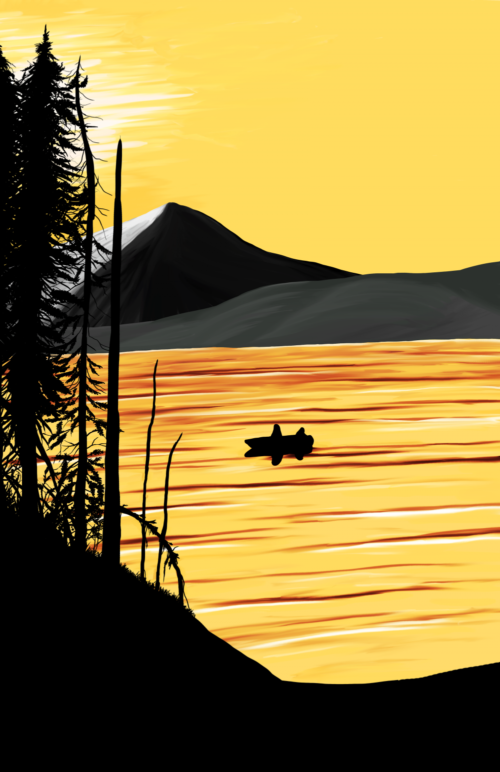
I hope that’s not too much gold. Looking at this version now it might be a little too bright. It definitely needed a shot of color though, no question. It’s easy enough to fix if it is indeed a little too bright. This image should be a decent size, so full screen it to get a proper look at it. Let me know in the comments if the color is too much, please!
Today I added more branches and detail to the trees (Boy are those dying trees taking forever to finish!) and I’m closer to the lake looking more realistic. It’s not quite there yet, but it’s close. I also added a gradient overlay to the sky and water to give it more color. Doing it that way makes it easily editable no matter what else I add to the painting.
Tomorrow I think I’m going to get started, and possibly finish, the dock. That boat had to of came from somewhere!
Help support my creative habit by liking, sharing, or commenting on my posts! Visit me on the Facebooks! Or, if you like, click right here! to help support me and my creative habit financially. Any and all assistance is greatly appreciated! 🙂
