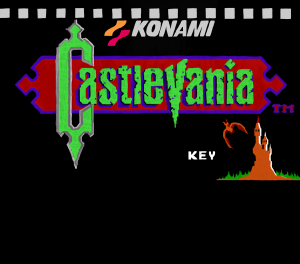
Today’s post is just a super quick update. Hope everyone’s having an enjoyable Sunday. I went ahead and spent 45 minutes smoothing out my Castlevania title screen. The Konami text and logo, the bat, the castle, and the word “key” have all had their rough pixel-look removed and replaced with what I can only call pure smoothness.
I think this Castlevania picture looks much better this way, and as I’ve said in previous posts, consistency is important. I’ still unsure 100% whether I can put these on t-shirts in the future, but I’ll continue to look into it.

