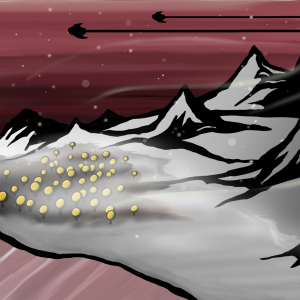
Hello! I’ve been having a lot of fun doing these daily scenery drawings, and there are a few things I really like about what I drew today; such as the sky and those ship silhouettes. That snowy fog-like mist looks pretty awesome as well. However, I’m not a huge fan of those funny looking alien trees, or those mountains. And I think I probably should of left out that black outline.
Yesterday, I spent a few hours reading about color theory. I was hoping there was going to be some ultimate lesson to learn when I finished reading about it, however… besides the fact that I’ll pay more attention to it now, I feel that I’ve pretty much always trying to make sure the colors I use bring out specific emotions and directed a viewers eyes to a particular section of an image. Which is what color theory seems to be all about.
For the picture above, I made sure to use soft colors all around so none of the color feels overpowering. The mountains stand out a bit because of the contrast between the grey and the black. And the silhouetted ships draw a lot of focus. I’m certainly no expert as to the why’s and the how’s in particular when it comes to color theory, but I realized last night, while studying, that apparently I’ve had an eye for this for a long time.
I plan to continue reading about color theory, but I think there might be more important things for me to focus on. Mainly, I need to get decent at drawing figures. Not necessarily Humanoid figures either. If I plan to someday create a story, a universe, with characters, then I will absolutely need to be capable of building characters to live within it.
Help support my creative habit by liking, sharing, or commenting on my posts! Visit me on the Facebooks! Or, if you like, click right here! to help support me and my creative habit financially. Any and all assistance is greatly appreciated! 🙂


