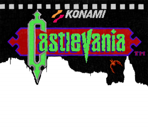
I spent a few hours today digitally painting in Photoshop. I painted over the white squares at the top as well as the “Konami” text because they were way too white originally. On the actual screenshot of the Castlevania title screen I noticed they were supposed to be gray. I was going to try and use some Photoshop magic to alter the color, but I ultimately decided to just paint over top. It may have taken awhile to do, but it looks good now and that’s what matters.
I’ve noticed that I haven’t been 100% consistent in what I’m doing with this one. Most of it looks pixellated, as I was trying to paint it pretty authentically, but the large “C” is pretty smooth. That’s a mistake on my part and probably a result of not exactly planning it out when I started. I went ahead and redid the Konami swoosh icon too, because yesterday’s version was smooth rather than pixellated. I’m not going to redo the “C” though, it still looks good and I’m just going to move forward so I can finish this. There’s still a lot of work yet to do. If it stands out that much when I’m done, then I can always go back and alter it as needed.
What else… oh! That bat looks good. The “TM” looks okay, but I had to redo it a few times to get it looking good enough. It’s been difficult to resist making everything I’m painting as smooth as possible. Instead, it has to have a bit of that old-school NES pixel feel, despite it being painted. I want it to look fresh and just enough different when it’s finished, but still be recognizable as a classic title screen.
So, that’s it for today. Not a whole lot going on today, despite it being Friday. I’ll probably do some more painting at some point later tonight.
Help support my creative habit by liking, sharing, or commenting on my posts! Visit me on the Facebooks! Or, if you like, click right here! to help support me and my creative habit financially. Any and all assistance is greatly appreciated! 🙂


