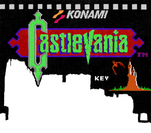
Going back and forth between the original 8-bit Castlevania title screen and my version of it, I’ve realized that I really should smooth everything out like I did with the game’s title and the border behind it. I think an upgraded version of it would fit best because it is meant to look like it was part of an HD remake. What do you think?

