
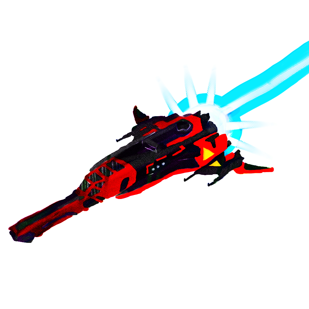
After painting another No Man’s Sky ship (I told you I was going to keep this up for awhile!) I decided that it looked pretty bland, so I messed around with it using some filters and the Photoshop tool that I use most often, the Mixer Brush. I feel that it turned out pretty awesome. Of course, you can’t really see the detail proper until you see it at it’s original size. Just click the image above and you’ll see that there’s quite a bit of varied detail and color.
Despite some abstract artwork I’ve done in the past, I don’t experiment all too often. It’s always a little scary to try new things, especially when it could mess up your original image. Though, of course I back up my originals just in case, but I still dislike spending too much time messing around with something, unsure exactly how it will turn out. Sometimes I feel that it’s time wasted, and when you go look at the original you realize it’s best left as it was. Other times, you learn some new techniques and conceive some new ideas for future projects.
Today’s work was productive. I tried something different, and it made my artwork better. I used a couple separate techniques I’ve learned over the past year, and combined them to make something entirely new. I discovered something today 🙂
You know, I really feel that I could use this version of Photoshop that I’m working with (which is a few years or so old at this point), and never truly master it in my life time. There will always be results that surprise me, I feel.
Help support my creative habit by liking, sharing, or commenting on my posts! Visit me on the Facebooks! Or, if you like, click right here! to help support me and my creative habit financially. Any and all assistance is greatly appreciated! 🙂
