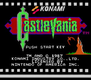
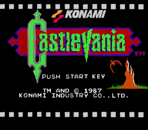
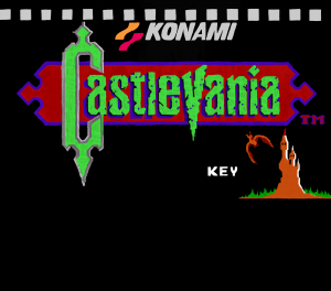
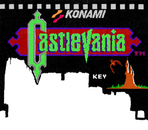
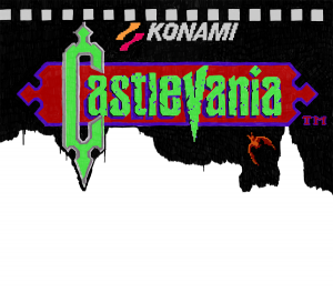
So there we go, I got all the main bits all together to form the NES classic Castlevania’s title screen. I’m noticing that I have to adjust a bit of the text because a couple of the characters aren’t quite in the right spot. However, before I upload these to be sold on t-shirts or as prints, I need to make sure I add my own personal touch to it. I have some ideas…
Category Archives: Nintendo
This category is reserved for Nintendo related artwork
Ideas From my Brain – Castlevania: Day 213
Besides touching up a few spots with some detail, and a gray line at the bottom, I have just a bit of text left to do before I’m finished my first NES title screen! Despite being asked in a comment the other day to do Super Mario Bros. 3 next, I think I’m going to start on Castlevania II: Simon’s Quest. I’m just thinking about this now, so I could very well change my mind by tomorrow. We’ll see…
Quick Castlevania Update: Day 212
Today’s post is just a super quick update. Hope everyone’s having an enjoyable Sunday. I went ahead and spent 45 minutes smoothing out my Castlevania title screen. The Konami text and logo, the bat, the castle, and the word “key” have all had their rough pixel-look removed and replaced with what I can only call pure smoothness.
I think this Castlevania picture looks much better this way, and as I’ve said in previous posts, consistency is important. I’ still unsure 100% whether I can put these on t-shirts in the future, but I’ll continue to look into it.
Castle of Vania: Day 211
Going back and forth between the original 8-bit Castlevania title screen and my version of it, I’ve realized that I really should smooth everything out like I did with the game’s title and the border behind it. I think an upgraded version of it would fit best because it is meant to look like it was part of an HD remake. What do you think?
The Bat: Day 210
I spent a few hours today digitally painting in Photoshop. I painted over the white squares at the top as well as the “Konami” text because they were way too white originally. On the actual screenshot of the Castlevania title screen I noticed they were supposed to be gray. I was going to try and use some Photoshop magic to alter the color, but I ultimately decided to just paint over top. It may have taken awhile to do, but it looks good now and that’s what matters.
Ashlynn Arias: Day 209
I’m so excited with how this is turning out! Just look at it. Especially when you compare it to yesterday’s picture. Today, I spent a couple hours going over the whole thing once again making the paint more solid looking. What a difference that made, eh? It’s going to look fantastic when I make a whole bunch and put them all together. I could literally do like 50 of these NES title screens, with each game having some type of impact on my childhood.
And Now For Something Completely Different: Day 208
I finally got started on my Nintendo title screens! I decided to set aside what I was working on yesterday, and move onto something I could get a bit excited about. It’s funny though, when you’re working on the really small scale, and you get thinking that things might not looking quite detailed enough, you zoom out and look at the picture in it’s entirety and find that things are actually turning out okay.
