
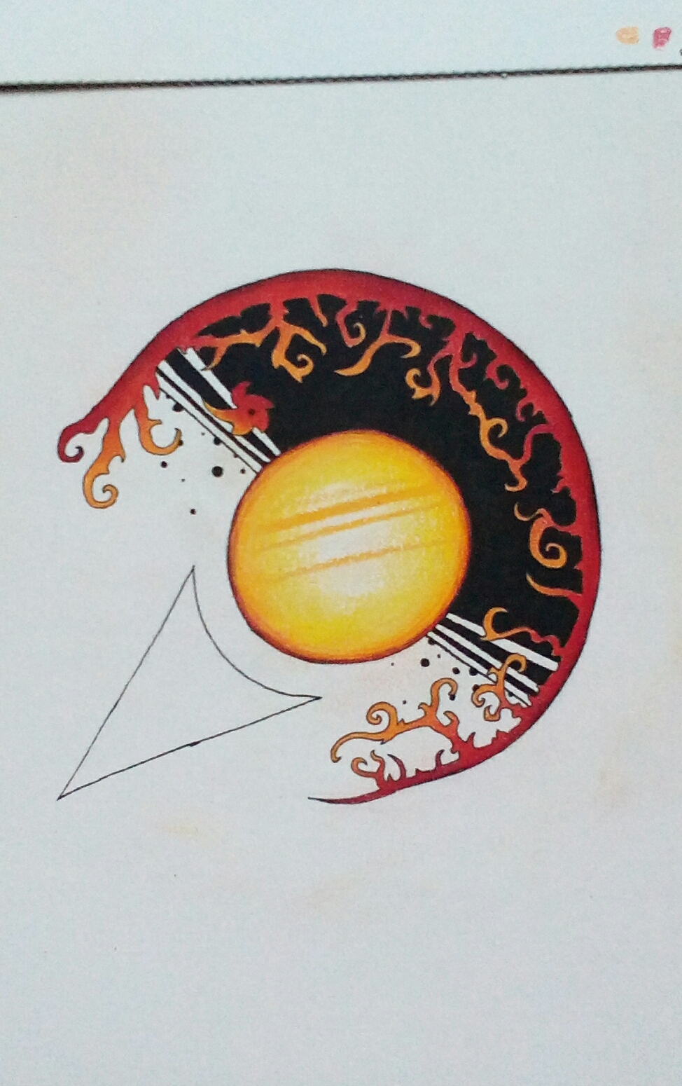
I was more excited to get going on today’s creative project than I’ve been in a long time. I’m really loving how this is turning out so far. However, when I look at this photo, which was actually taken under proper sunlight, I don’t get the same feeling as I get from looking at the actual piece on paper. Not sure why that is exactly. Maybe the colors are more washed out in the photo, and I think it’s a littler blurry in places. And that’s pretty lame.
I’ll do whatever I can do to continue trying to take better photographs to represent my artwork in the online space. You know, that’s one huge reason why I really love doing digital work; it always ends up at the highest quality as far as something that’s inherently pixel perfect goes. I’m no photographer. Creating artwork with pens, pencils, and literally getting my hands dirty in the process, just feels a whole lot better. I enjoy the process more when I’m creating with my hands with many tools, than when I create anything digitally. When I put it that way, it sounds dumb, because I’m sure every single artist will agree with that. Well, probably…
I’m just going to throw this in here at the end, but is it just me or do you also get a Millennium Falcon vibe from this drawing?